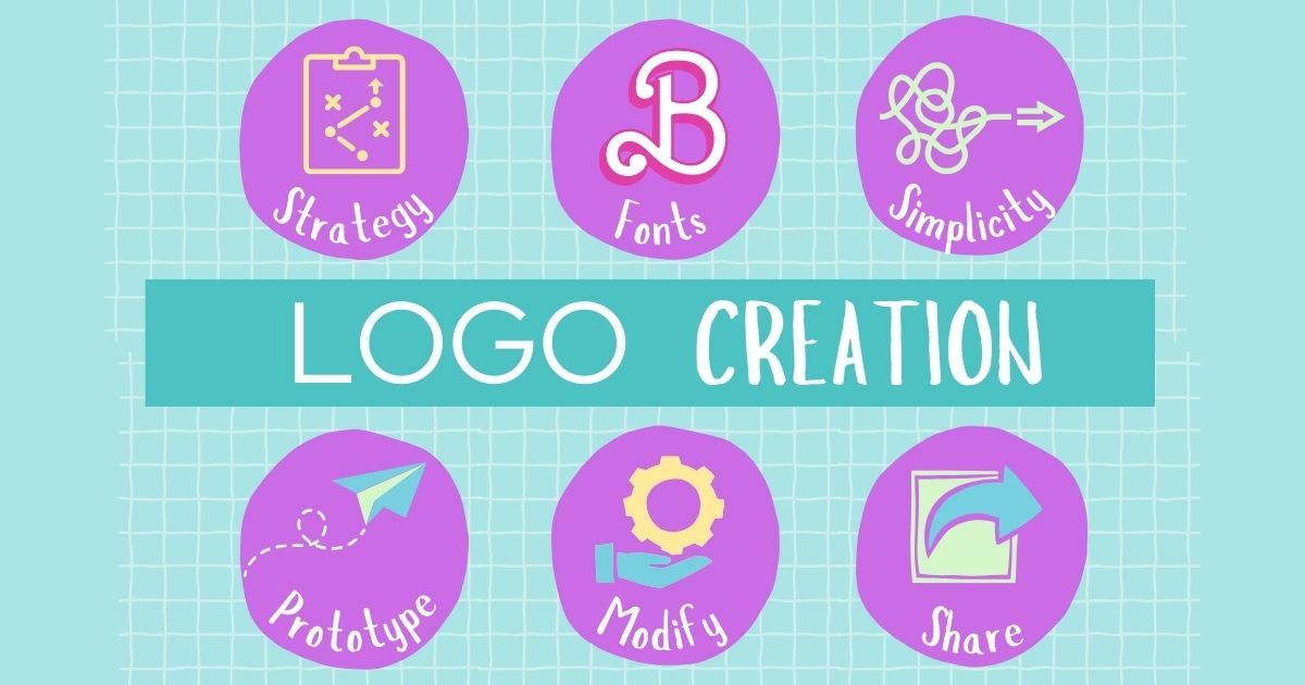
What to Know Before You Start Designing a Logo
Creating a logo for a
convention or event marketing isn’t just about looking cool — it’s about building trust, capturing attention, and ensuring that your brand shines across every platform, from stage screens to embroidered polos.
Whether you're organizing a regional conference, nonprofit fundraiser, or industry trade show, a strong, versatile logo is foundational. Here's how to make sure your design delivers, and how tools like Hatchwise and AI (hello, ChatGPT!) can streamline the process.
Start With Strategy: Ask the Right Questions
Before diving into design, we always recommend starting with these key questions:
- Where will the logo appear? Think beyond your website. Will this logo be embroidered on staff shirts? Printed on massive banners? Shared in social media profile pics? Your design needs to be versatile across digital and physical formats.
- How many colors should it have? Every color can add complexity and cost. Embroidery, for example, is more expensive and less readable with too many colors. Stick with a clean, bold palette.
- Does it work in black & white or reversed? Great logos are adaptable. Test your logo in grayscale and against dark backgrounds. Will it still be recognizable and strong?
- How clean is it? A logo blown up on a projection screen will highlight every little detail and not always in a good way. Avoid overly complex line work that might clutter the message.
Design & Technical Considerations You Can't Skip
A solid logo must look good and be technically sound. Here’s what we look out for:
- File format matters: Logos designed in RGB (for screens) need to be converted to CMYK (for printing). If you're not careful, your colors might print totally different from what you see on screen.
- Think inclusively — colorblind friendliness: Your color choices should maintain contrast and clarity for all users. There are free tools available that simulate colorblind vision — worth checking before you finalize.
- Fonts and licensing: Don’t just grab any font from the internet. We guide our clients to use licensed fonts from platforms like MyFonts or public domain options. This protects your brand from unexpected legal headaches.
- Do you have the rights to your graphics? Whether using AI-generated art, hiring a designer, or sourcing from platforms like Hatchwise, always confirm you have commercial rights to every element of your logo.
Don’t Forget Digital Optimization
Your logo will be everywhere — your website, Instagram bio, email signature, mobile app icon. For that reason:
- Create a social-friendly profile version that scales well down to 1” or less. We recommend also creating a Favicon version (16x16px) for browsers.
- Simplify for scalability: The most memorable logos (think Nike, Apple, TED) are simple. Avoid fine lines, overly detailed graphics, or multiple small elements that won’t scale well.
Using Tools Like Hatchwise and AI to Jumpstart the Process
At Marketing Angle, we often use collaborative platforms like Hatchwise to crowdsource creative ideas quickly. Pairing these designs with AI assistance (like ChatGPT) allows us to refine concepts fast, ensuring both creativity and consistency.
But tools are just tools — your success lies in having a strategy-led, professionally guided design process.
Why This Matters for Your Convention
Your logo is often the first impression people have of your event or organization. It sets the tone. It shows professionalism. And most importantly, it builds recognition and trust.
We help local organizations, nonprofits, and businesses create logos that work hard — across every channel, platform, and product. From embroidery to Instagram, we make sure you’re covered.
If you’re ready to create a logo that represents your mission with clarity and impact, Marketing Angle is here to guide you every step of the way.
FAQs: Logo Design for Conventions & Events
What makes a good convention logo design?
A great convention logo is simple, scalable, and versatile. It should be legible on a large screen, clear when embroidered on apparel, and adaptable across print and digital platforms. Focus on clean lines, limited colors, and a design that works well in both color and black & white formats.
Can I use free fonts or images in my logo?
Only if they’re properly licensed. Many "free" fonts or graphics are not approved for commercial use, which can lead to legal issues down the road. We recommend using licensed fonts from trusted platforms like MyFonts or sourcing artwork with full commercial rights — especially if you're using design contests or tools like Hatchwise.
Why does my logo look different when printed?
This is usually due to color format differences — screens use RGB, while printers use CMYK. If a logo is designed in RGB and not properly converted, colors may appear dull or off when printed. Always ensure your designer provides CMYK-ready files for print and RGB versions for digital use.